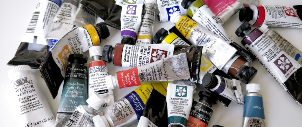
Each watercolor manufacturer has dozens and dozens of colors each more appealing than the others. So how to find and build your ideal palette ?
Colors are a personal choice
We often say that everyone taste is different ! That’s also true for watercolors. Choosing a particular color is very personal. It can be based on facts : transparency, lightfastness or the quantity of pigment in it… But it can also be based on feeling. For example, i don’t have any cadmium pigment in my palette because they are too opaque for my taste. And i don’t planned to add orange in my palette because i don’t like that color. But i could add tons and tons of blues and purples because i love them so much !
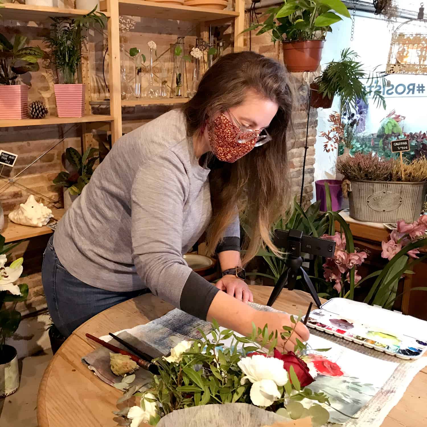
When starting in the watercolor world it’s even more difficult to choose a color. You don’t know for now what you like or dislike. But step by step, you will find your taste and you’ll be able to choose a good color for your liking. Some brands offer dots card and it’s the perfect way to test some colors before buying.
Study quality or extra-fine ?
There is here no bad choices. It totally depends of what you would like to achieve. The principale differences between study or extra-fine quality are : the density of pigments, the binder sometimes, the lightfastness (the capacity of one color to resist to the light) and of course the price. If painting is just a hobby, a way to relax and disconnect from work, the stury quality can be juste what you need. On the other hand, if you want to expose your work and deepen your practice, the artist or extra-fine quality is for you.
The base of a watercolor palette
My ideal palette would content : a warm blue, a cold blue, a warm red, a cold red, a warm yellow, a cold yellow, one or two earth colors and a neutral color. With this set of colors you can create so much mixes. To have the cold and the warm variation for the primary colors (blue, red, yellow) allows you to have a deepest range of colors.
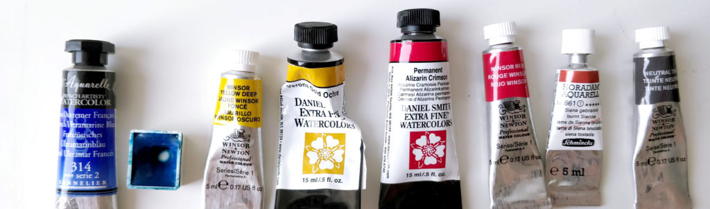
So what’s going on my palette at the moment ? I don’t have exactly that set but i’m very close to (and you’re free to adapt this set for your liking). For the blues, i have ultramarine blue (warm) and manganese blue (cold). The reds are winsor red (warm) and permanent alizarine crimson (cool, but i would like to replace it by something like quinacridone pink). And for the yellow i have winsor yellow deep (warm) and verona gold ochre (which is an earth color). I don’t have any cold yellow because i don’t need it so much in my style of painting. And for the complementary colors i have burnt sienna and neutral tint.
Optional colors
With this set of colors i can have a lot of mixes and possibility. But it’s often more convenient to have some other colors which will help you with mixes you would have made all the time. They are here to ease your life !
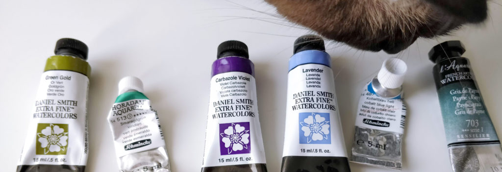
This colors are even more personal ! Because they are a reflection of your style of painting and of your favorite subject. In my case, i like to have green gold (thanks to this colors i can avoid to have a cold yellow in my palette), viridian, carbazole violet, lavander, cobalt blue and payn’s grey.
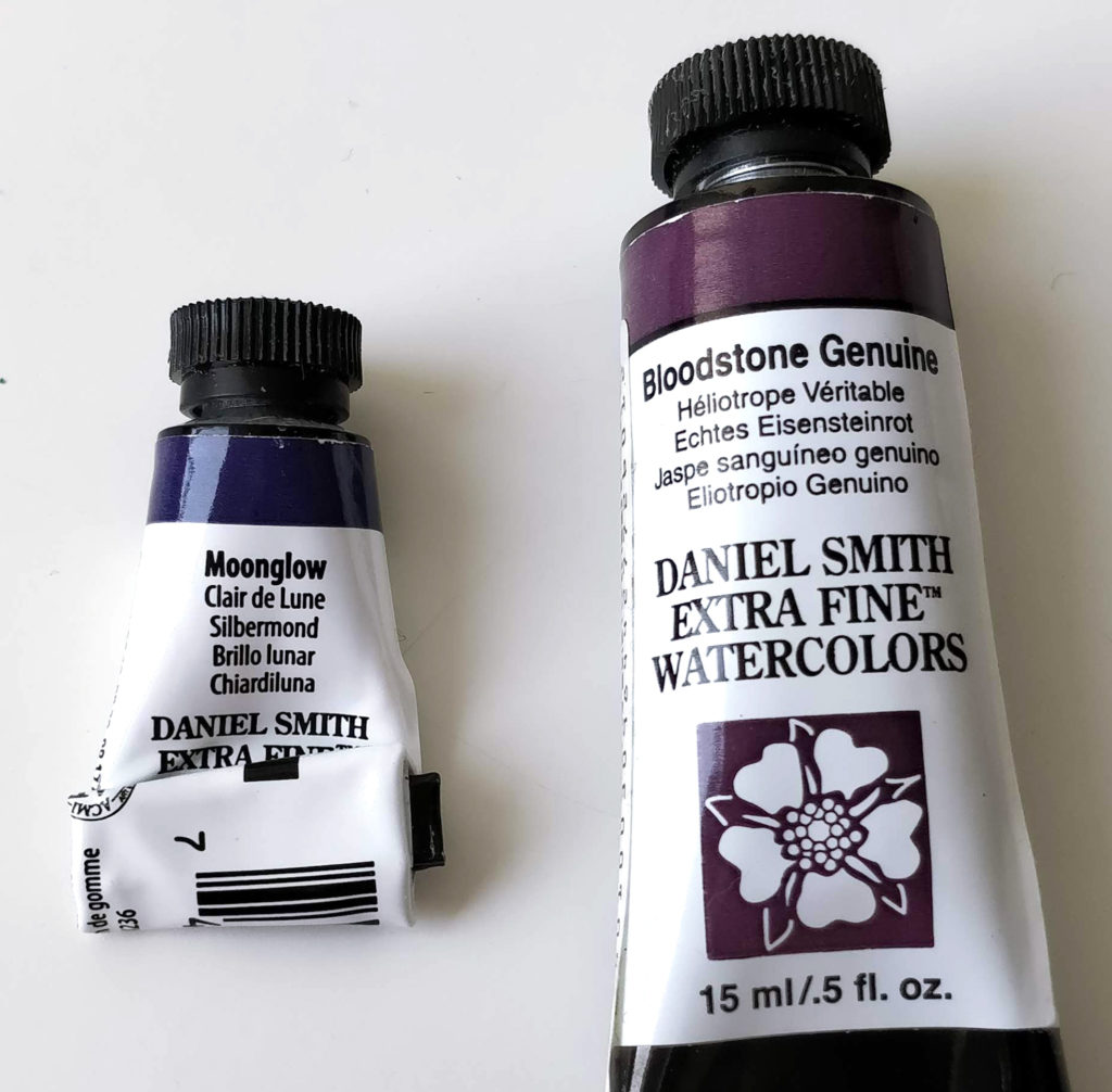
And finally, there is some very peculiar colors, mixes of certain pigments that are my favorite. They are special because of the way they behave on paper. They can granulate a lot for example or contain some shimmer or they can also break apart and reveal the different pigments in it. I have only two colors of that kind : bloodstone genuine and moonglow (from Daniel Smith).
My vision of the ideal palette presented here is going to change and follow my taste and needs. No matter the quantity of colors we own, the creativity and what we do with it is the only thing that matters ! And you ? do you have some favorite colors ?