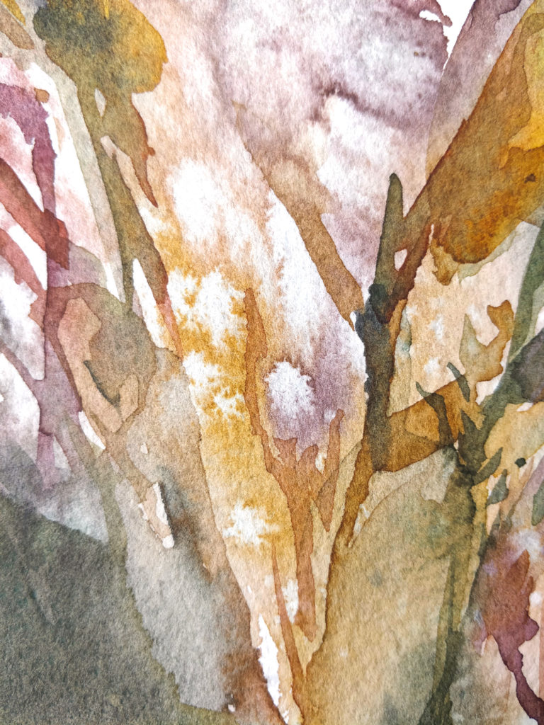
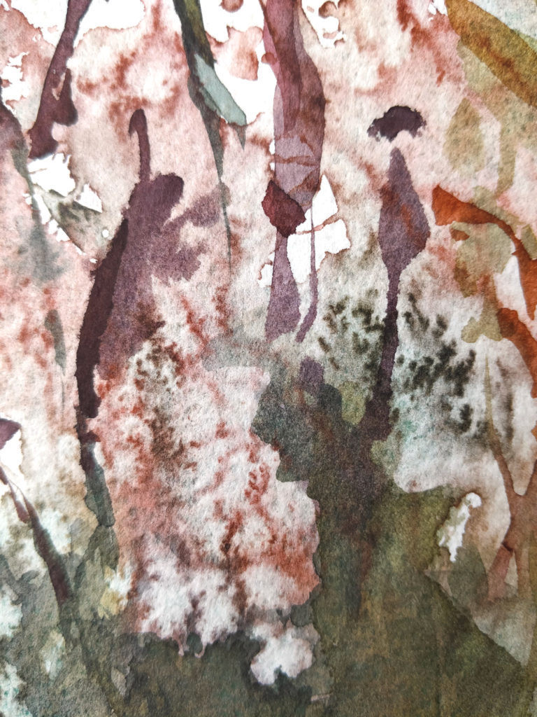
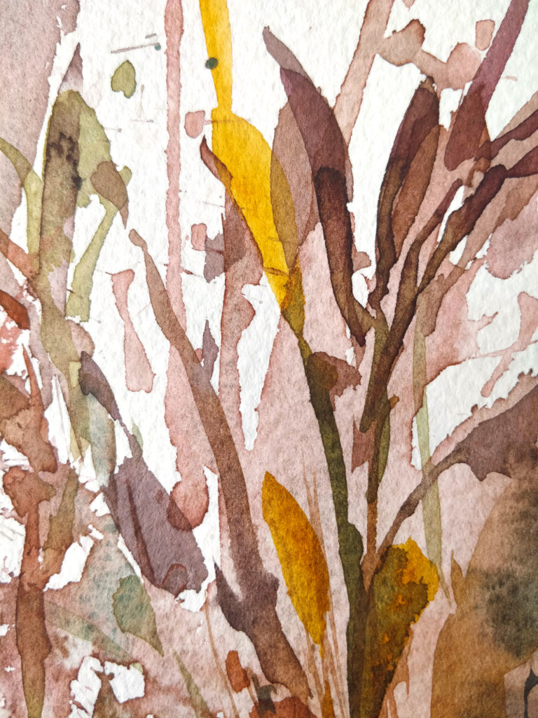
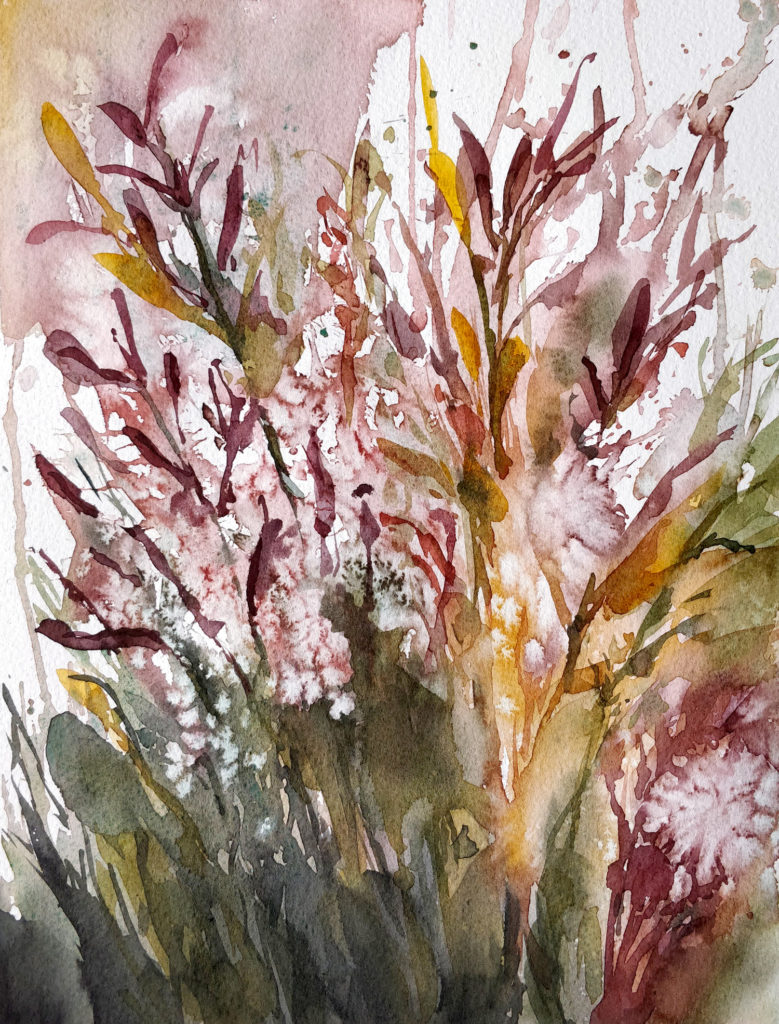
Fall is emerging step by step and nature change colors slowly. This change brings so much inspiration too ! I can’t wait to see trees with gold and red hue in a few weeks. As i want to take a lead, here you have a painting of a plant (maybe a weed) with fall colors.
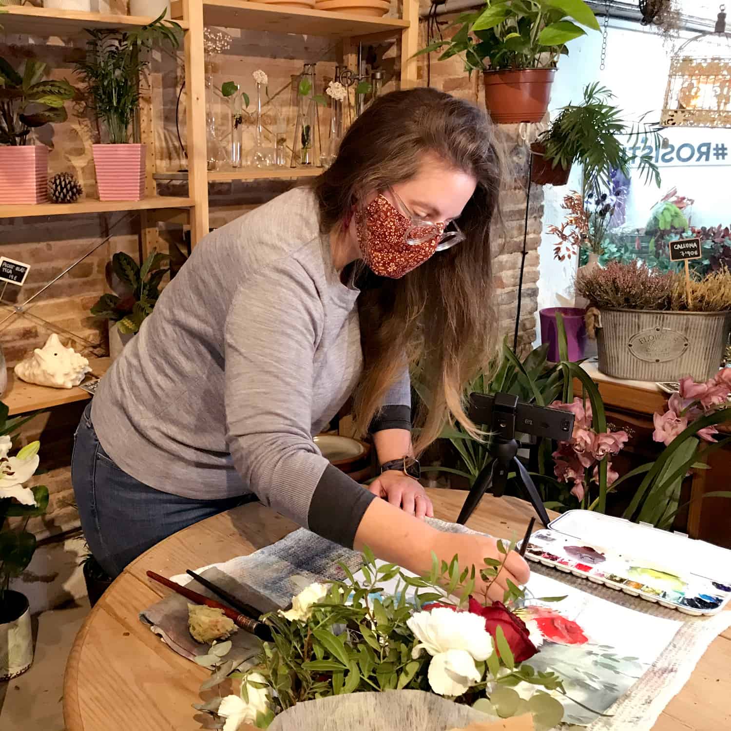
Big news this week for my english-speaker audience ! I haven’t wrote the subtitles for this video because i’ve upload another video on my channel with the voice over in english !!! It’s quite a big deal for me as i know i have an awful french accent when i speak english. But i thought it was a good idea to improve it anyway !
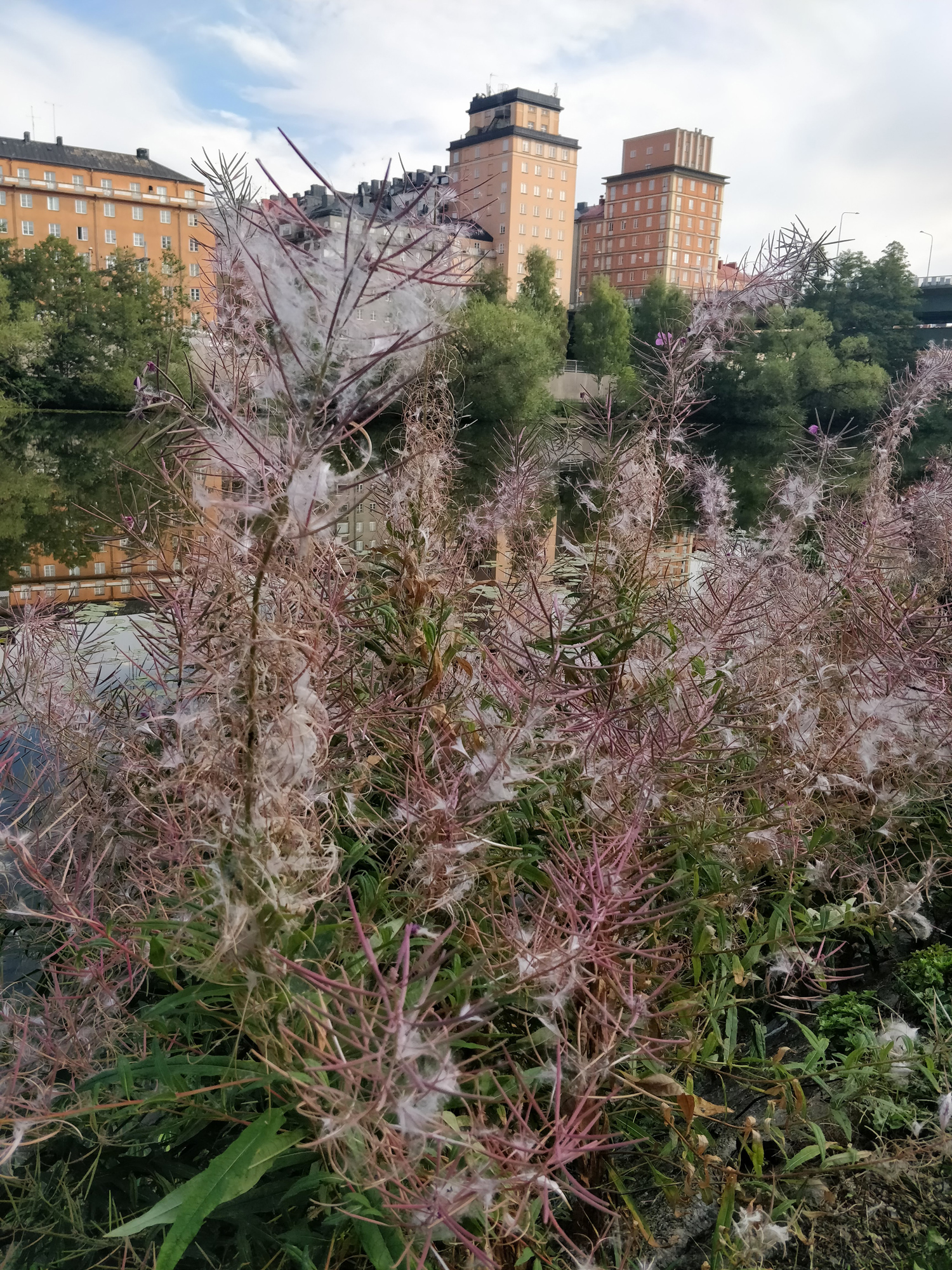
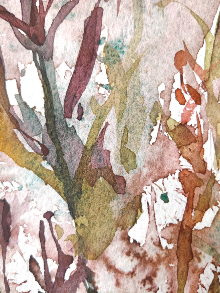
Back to the painting. I’ve hesitate to show you my reference picture. Once i’ve finished my painting, i’ve figured out that i was far away from my reference image ! But in an other hand, maybe it could help you to take a step back from your reference picture sometimes. This image is here to guide your painting, but it shouldn’t keep you from moving ! it’s only a support for your imagination.
On this image, we could see a bush formed by some sort of plants which i don’t know at all. They could be weeds as i found them on the side of a road. Their seeds are wooly, a bit like dandelion, and the stems are covered with some sort of pods in a red/rust color. This image may intimidate you by its complexity, but it’s quite easy to paint in fact !
Fall impression in video
When i am face to face with a very complicate and organique image, my first reaction is to take the opportunity to work in a very spontaneous way. Like starting with some splatters and drops of water. It’s a good way to stay away from a realistic approach. The salt also add some unexpected texture and reinforced the drafty, explosive aspect if my painting.
I didn’t use much supplies in this painting and i surely could have done it with even less supplies. One brush, 5 colors (maybe 4 or even 3 are enough), salt and that’s all !
SUPPLIES :
Brush : Escoda Aquario nº18.
Paper : Canson Héritage rough
Colors : Viridian (Schmincke), Quinacridone gold (Daniel Smith), Permanent alizarine crimson (Daniel Smith), Winsor red (Winsor & Newton), Neutral tint (Winsor & Newton).
And here you have the finish painting :