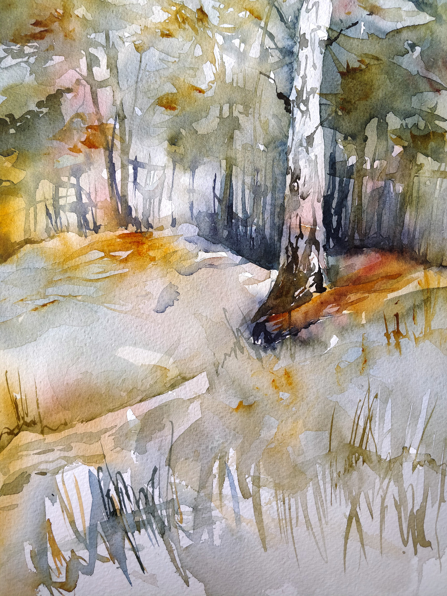
This week i can finally enjoy all the colors of fall and it’s became my subject as i’m painting this forest landscape !
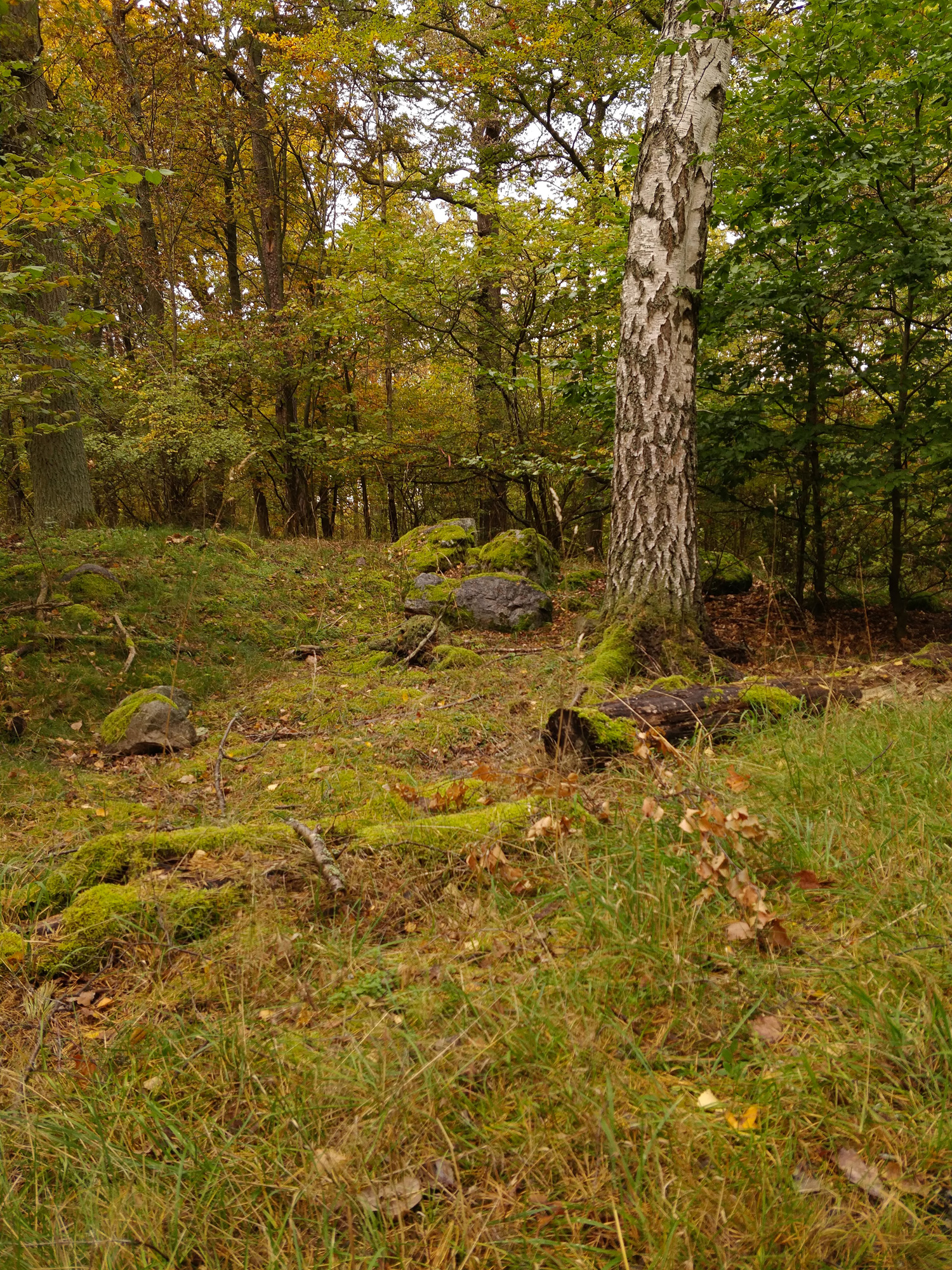
My reference picture above has the perfect fall colors : gold, orange, red and green. But my picture is lacking a bit of contrast. The sky was very cloudy this day so the scene has a very uniform dull light. So i don’t have strong shadows and sunlight areas. I will have to recreate a bit of light and shadow in order to create a nice atmosfere and give the scene more depth.
While i was modifying the contrast i also playing with the colors and modify them a little bit from my reference picture. I painted less greens and i added much more warm colors. I made this choice to reinforce the idea of fall and to match a little bit better my memories from the scene in real life. Working from a picture is good because it’s easier to draw an image already in 2D, but it’s even better if one use the memories from the scene in real life and add more personnal bits to it. Generally, i’m a bit disapointed by my painting when i paint a scene from a photo without living the scene myself. Our feelings and emotions are adding a lot to our art !
Fall forest in watercolor
Supplies :
Brush : Escoda aquario nº18, Rosemary&Co serie 39 1/2″.
Paper : Canson Héritage rough.
Colors : Indanthrene blue (Sennelier), Aussie red gold (Daniel Smith), Quinacridone burnt scarlet (Daniel Smith), Carbazole violet (Daniel Smith).
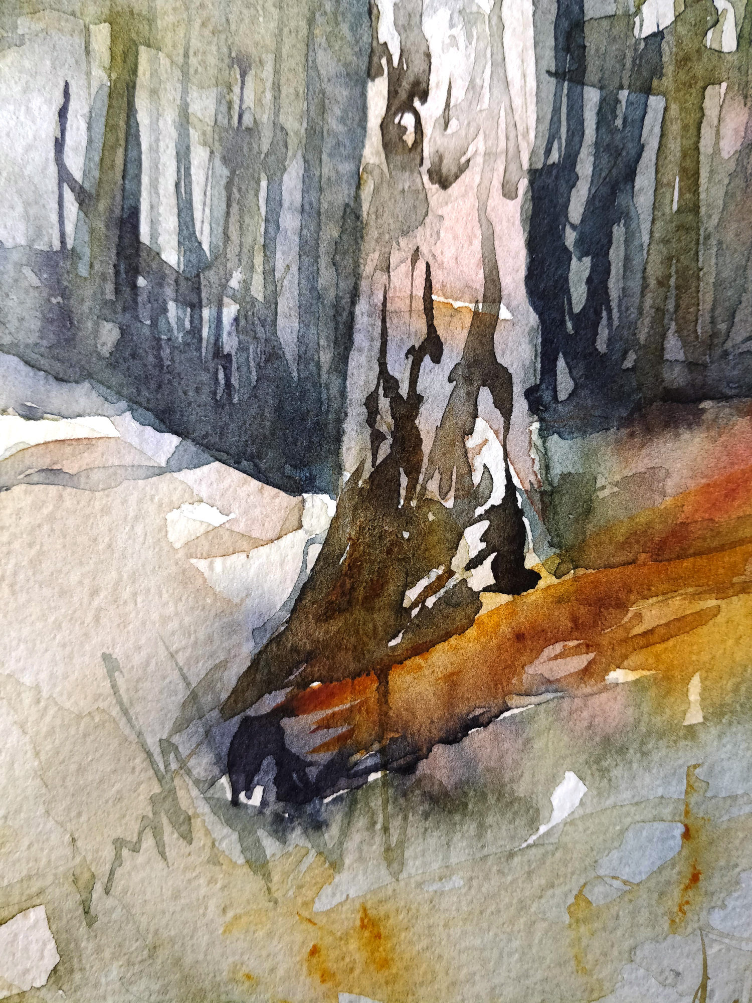
And here you have the finished painting (Click to enlarge) :